My Ideal CI/CD Workflow for Solo macOS Development
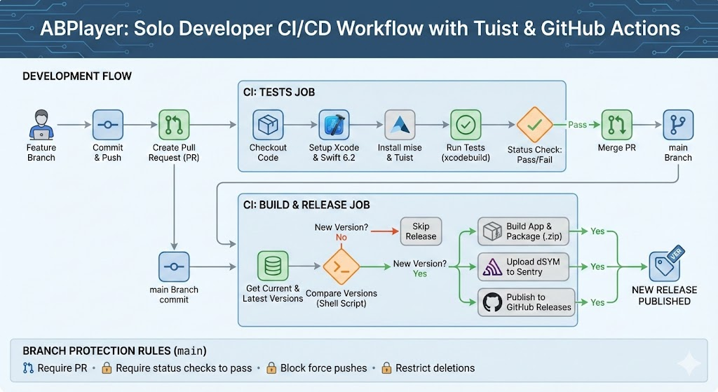
TL;DR
You can view the full GitHub Workflows file here.
Recently, I’ve been developing ABPlayer, a macOS app that allows users to import audio, supports transcription generation, and enables simultaneous listening and watching. I have configured GitHub Actions into what I consider the optimal setup for a one-person development team.
I use Tuist to generate the macOS project. I chose Tuist because native Xcode project files (.xcodeproj) often suffer from poor readability and prone to conflicts, even in solo projects (and especially in collaboration). With this setup, the CI system only needs to read and process Tuist’s Project.swift file.
Using Nano Banana Pro to create an app icon
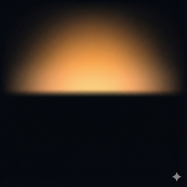
1
A minimalist abstract graphic design of a sunrise breaking through darkness. The composition is a full square, edge-to-edge design with no borders and no rounded corners. The bottom section is deep midnight black representing the night. A warm, glowing amber and golden apricot light rises softly from the horizon line, diffusing into the darkness. Atmospheric lighting, subtle grain texture, smooth gradients, modern aesthetic. High definition, 8k resolution, flat surface. --ar 1:1This is the App icon generated using the prompt above.
How to Generate the Prompt Above
Use the prompt below to create the actual prompt for the App Icon. I used Chinese for this example, but feel free to translate it into English and tweak it to fit your needs. I’m just sharing the general workflow here.
1
需要生成一个iOS app 的icon, 辅助我写prompt. 你是一个位资深的app设计师. 对于绘制app icon非常精通, 能用流程化的方式, 绘制出简洁又有深意的App iconI sent this to Gemini 3 Pro and got the following response:
1
2
3
4
5
6
7
8
9
10
11
12
13
14
15
16
17
18
19
20
21
22
23
24
25
26
27
28
29
30
31
32
33
34
35
36
37
38
39
40
41
42
43
44
45
46
47
48
49
50
51
52
53
54
55
56
57
58
59
60
61
62
63
64
65
66
67
68
69
70
71
72
73
74
75
76
77
78
79
80
81
82
83
84
85
86
87
88
89
90
91
92
93
94
你好。很高兴能以资深设计师的身份协助你。

设计一枚优秀的 iOS App Icon,绝不仅仅是画一个好看的图形。它是在方寸之间,用最极简的视觉语言,浓缩产品的核心价值和灵魂。它必须在拥挤的手机主屏幕上瞬间抓住用户的眼球,并传达出“我是干什么的”。

作为一名深耕 iOS 设计规范多年的设计师,我有一套成熟的“结构化设计流程”。我们将分四个阶段来完成这个任务。请跟随我的引导,一步步提供必要的信息,最后我会为你合成一条高质量的 AI 绘图 Prompt。

我们的设计流程:
核心定义 (Discovery): 理解 App 的灵魂。

隐喻与符号 (Metaphor): 寻找视觉载体。

风格与美学 (Aesthetics): 确定视觉语言。

Prompt 合成 (Synthesis): 生成最终指令。

阶段一:核心定义 (Discovery)
一枚好的图标始于对产品的深刻理解。请尽可能精炼地回答以下问题:

App 的核心功能是什么? (请用一句话概括,例如:“一个帮助用户管理植物浇水周期的工具” 或 “一个专注于极简主义的番茄工作法时钟”。)

App 的目标用户和情绪基调 (Vibe) 是怎样的? (例如:专业的/金融的;活泼的/游戏化的;宁静的/冥想的;高效的/工具类的。)

App 的名称是什么? (有时名称本身就包含视觉线索,比如 "Spotify" 或 "Airbnb"。如果没有也没关系,切记 iOS 图标中尽量不要出现文字。)

👉 请在此处回复阶段一的答案。

(等待你的回复后,我会引导你进入下一阶段。为了演示,我先假设一个案例,展示整个流程是如何运作的)

【演示案例:假设你要做一个名为 "FlowWrite" 的极简写作 App】
假设你给我的回复是:

核心功能:一个让用户专注于写作,排除一切干扰的极简文本编辑器。

基调:宁静的、富有创造力的、极其干净和现代的。

名称:FlowWrite。

阶段二:隐喻与符号 (Metaphor)
(根据你的回复,我会分析并提出建议。以下是基于演示案例的分析)

设计师分析: 对于“专注写作”和“心流 (Flow)”,我们不能只画一支笔或一张纸,那样太直白且无聊。我们需要寻找更深层次的隐喻。

概念 A (侧重“心流”): 水流、波纹。代表思绪的顺畅无阻。

概念 B (侧重“专注与极简”): 一个极其干净的几何形状,比如一个完美的圆点,或者一条抽象的线段。代表聚焦。

概念 C (侧重“创造力”): 抽象的羽毛笔尖,或者墨水晕开的瞬间。

我的建议方向: 结合“笔尖”与“心流”。一个抽象化的、流畅的线条组成的笔尖形状,看起来像是在流动。

👉 在实际流程中,这一步我会给你提供 2-3 个创意方向供你选择,或者让你提供你脑海中浮现的第一个物体。

阶段三:风格与美学 (Aesthetics)
(以下是基于演示案例的分析)

设计师分析: iOS 的设计趋势目前主要有几种:

现代拟物 (Modern Skeuomorphism / Depth): 有微妙的渐变、柔和的阴影和层次感,看起来想触摸它。(Apple 原生应用多为此类,如相册、Safari)。

超级扁平 (Super Flat): 没有任何质感和阴影,纯色块。(现在比较少见,容易显得廉价)。

3D 渲染 (3D Render): 看起来像一个可爱的 3D 玩具模型,材质感很强。(常用于游戏或年轻化的应用)。

对于 FlowWrite,我建议采用 “现代拟物 (Modern Depth)” 风格。它既保持了极简,又通过微妙的质感显得高级。

颜色: 既然是宁静的,我建议使用冷色调。例如:深海蓝渐变到青色,或者一个非常干净的米白色背景配上深灰色的主体。

👉 在实际流程中,你需要告诉我你偏好的风格类型和核心配色方案。

阶段四:Prompt 合成 (Synthesis)
(现在,我将把以上所有信息,转化为 AI 能听懂的专业术语。这是最关键的一步。)

基于演示案例 "FlowWrite" 的最终 Prompt:

Markdown

**Prompt:**
An iOS app icon for "FlowWrite", a minimalist writing tool. The design features an abstract, fluid line forming a stylized fountain pen nib, suggesting creative flow and focus. The style is modern Apple aesthetic, with subtle depth, soft gradients, and a tactile feel, not flat. The color palette uses deep ocean blues transitioning to soft teal, set against a clean, off-white background. The composition is centered and balanced within a squircle shape. High quality render, 4k, detailed texture, minimalist design. --ar 1:1
Prompt 解析(设计师的秘密配方):

主体明确: "An iOS app icon for..." 开门见山定性。

核心隐喻: "abstract, fluid line forming a stylized fountain pen nib" 描述了我们确定的符号。

风格界定: "modern Apple aesthetic, with subtle depth, soft gradients... not flat" 这是为了防止 AI 生成过时的扁平化图标。

颜色指定: "deep ocean blues transitioning to soft teal" 精确控制色彩氛围。

构图与容器: "centered... within a squircle shape" 强调了 iOS 图标的物理形态。

质量增强词: "High quality render, 4k, detailed texture" 保证输出的精细度。

现在,轮到你了。
请回到 “阶段一:核心定义”,回答那三个问题,我们开始创造属于你的 App Icon。
From there, just answer the questions one by one. Eventually, you will get the final prompt to use for image generation. If the image doesn’t turn out quite right, just keep the conversation going to refine it and get a new prompt.
Hope everyone gets an image they’re happy with!
SwiftUI’s Unexpected Behaviours - A Case Study on Padding and Backgrounds
Many developers complain about SwiftUI because some of its behaviours feel counter-intuitive. For example, in the code at #1, if you comment out the .padding() modifier, the entire area above the search field turns red. That happens because the background of the search view bleeds into its parent container. If you don’t want the Search view’s background to affect the parent view, you have to break that view hierarchy connection.

1
2
3
4
5
6
7
8
9
10
11
12
13
14
15
    var body: some View {
        VStack(spacing: 24) {
            search
            Spacer()
        }
//        .padding() // #1
        .background(ThoughtStreamAsset.Colors.bgPrimary.swiftUIColor)
    }

    var search: some View {
        TextField("Search", text: $searchText, prompt: Text("Search your knowledge base").foregroundColor(.gray))
            .foregroundColor(ThoughtStreamAsset.Colors.textPrimary.swiftUIColor)
            .padding()
            .background(Color.red)
    }
When the padding at #1 is not commented out, the layout renders as expected:
But when you remove the parent padding, SwiftUI changes how the backgroud is applied, causing the red search background to expand and cover areas you wouldn’t expect. These kinds of layout propagation rules are often why developers find SwiftUI unintuitive.

obtain the scrollView's offset
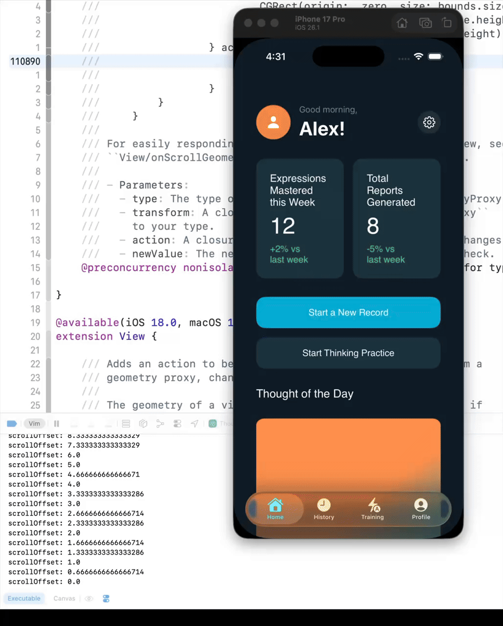
Before iOS 16, you could get the ScrollView’s offset using the following code. However, if the UI becomes complex, the scrollViewOffset will not update while scrolling.
1
2
3
4
5
6
7
8
9
10
11
12
13
14
15
16
17
18
19
20
21
22
23
24
25
26
27
28
ScrollView {
	VStack(alignment: .leading, spacing: 32) {
		// 1. 将监测器独立出来,包裹在无间距的 VStack 中以避免布局干扰
		VStack(spacing: 0) {
			Color.clear
				.frame(height: 0) // 占据 0 高度,不可见但存在
				.background(
				    GeometryReader { proxy in
				        Color.clear
				            .preference(
				                key: ScrollOffsetKey.self,
				                value: proxy.frame(in: .named("scroll")).minY
				            )
				    }
				)

			LargeNavBarView()
				.opacity(largeHeaderOpacity)
		}

		ContentArea
	}
	.padding(.horizontal, 24)
}
.coordinateSpace(name: "scroll")
.onPreferenceChange(ScrollOffsetKey.self) { value in
    self.scrollOffset = value
}
After iOS 16, you can reliably obtain the scrollView’s offset using the following code.
1
2
3
4
5
6
7
8
9
10
11
12
13
14
15
16
17
18
19
20
21
ScrollView {
	VStack(alignment: .leading, spacing: 32) {
		// 1. 将监测器独立出来,包裹在无间距的 VStack 中以避免布局干扰
		VStack(spacing: 0) {
			Color.clear
				.frame(height: 0) // 占据 0 高度,不可见但存在
				.onGeometryChange(for: CGFloat.self) { proxy in
					proxy.frame(in: .named("scroll")).minY
				} action: { newValue in
					self.scrollOffset = newValue
					print("scrollOffset: \(self.scrollOffset)")
				}

			LargeNavBarView()
				.opacity(largeHeaderOpacity)
		}

		ContentArea
	}
	.padding(.horizontal, 24)
}
How to hide `tabbar` in iOS 18?
I wrapped my view in a NavigationStack and used .toolbarVisibility(.hidden, for: .tabBar) to navigate while hiding the tab bar. However, this causes an issue: the transition animation becomes stiff and unnatural. I haven’t found a good solution yet.
I’m trying to research how Apple’s official apps handle this. It seems that many of them simply present a new view when they need to hide the tab bar.
The tab bar is generally always visible. When an app needs to hide it, the common pattern is to present a modal view, rather than pushing a view inside the existing navigation stack.
The completed code is here:
1
2
3
4
5
6
7
8
9
10
11
12
13
14
15
16
17
18
19
20
21
22
23
24
25
26
27
28
29
30
31
32
33
34
35
36
37
38
39
40
41
42
43
44
45
46
47
48
49
50
51
52
53
54
import SwiftUI
struct ContentView: View {
var body: some View {
TabView {
HomeTab()
.tabItem {
Label("Home", systemImage: "house.fill")
}
Text("Settings Tab")
.tabItem {
Label("Settings", systemImage: "gear")
}
}
}
}
struct HomeTab: View {
var body: some View {
NavigationStack {
MainView()
}
}
}
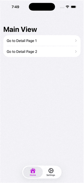
struct MainView: View {
var body: some View {
List {
NavigationLink("Go to Detail Page 1") {
DetailView(title: "Detail 1")
.toolbarVisibility(.hidden, for: .tabBar)
}
NavigationLink("Go to Detail Page 2") {
DetailView(title: "Detail 2")
}
}
.navigationTitle("Main View")
}
}
struct DetailView: View {
let title: String
var body: some View {
Text("This is the \(title)")
.navigationTitle(title)
.navigationBarTitleDisplayMode(.inline)
}
}
#Preview {
ContentView()
}Re-understanding Swift Protocol
🧠 Introduction
In Swift, Type Erasure is a key concept for understanding protocols and generics.
It explains why any exists and how Swift’s generic protocols differ from other languages.
1️⃣ Why Type Erasure Matters
1
2
3
4
protocol ReReduce {}
struct AppReduce: ReReduce {}

let a: any ReReduce = AppReduce()
any ReReduce means “a type that conforms to ReReduce,” , but the exact type is unknown at compile time.
The compiler performs type erasure, wrapping the value in an existential container. This allows storing and calling methods on multiple conforming types in one collection.
2️⃣ Generics vs Existential Types
1
2
func process<T: Reducable>(_ value: T) { }   // Generic
func process(_ value: any Reducable) { } // Existential| Feature | Generic |
Existential any |
|---|---|---|
| Type known | Compile-time | Runtime |
| Dispatch | Static (fast) | Dynamic (erased) |
| Mixed types | No | Yes |
| Use case | Performance, type safety | Polymorphism, flexibility |
Generics let the compiler know the type;
any lets it forget the type but keep its behavior.
3️⃣ Swift vs Other Languages
1
2
3
4
5
protocol ReReducer {
    associatedtype S
    associatedtype A
    func reduce(_ state: S, _ action: A) -> S
}
TypeScript equivalent:
1
2
3
interface ReReducer<S, A> {
  reduce(state: S, action: A): S;
}| Feature | Swift | TypeScript / C# |
|---|---|---|
| Generic style | associatedtype | <T> |
| Type decided | At implementation/use | At declaration |
| Can store in collection | Requires type erasure | Directly supported |
Swift needs type erasure to mix generic implementations in one array.
4️⃣ Binding Associated Types
You can fix associated types using typealias to unify them:
1
2
3
4
5
6
7
typealias AnyAppReducer = any ReReducer
  where S == AppState, A == AppAction

let reducers: [AnyAppReducer] = [
    AppReducer(),
    AnotherAppReducer()
]
🧩 Summary
| Concept | Meaning |
|---|---|
| any | Declares an existential type |
| Type Erasure | Hides concrete type for flexibility |
| Generics | Compile-time, high performance |
| Existentials | Runtime, dynamic and flexible |
| associatedtype | Defines generic protocols in Swift |
- Use generics for performance and type safety.
- Use any for polymorphism and dynamic flexibility.
Understanding type erasure helps you design clearer, more adaptable Swift architectures.
学习如何学习
上一次认真思考“如何学习”这件事,还是在看 Scott 那本书的时候。他一年之内自学完了四年制大学的 CS 课程。最近我又开始有点迷茫。快四十了,后端不算真正精通,iOS 技能也荒废了,语言也没学好。这些问题叠在一起,让我压力很大。结果又开始玩 Dota 2 来逃避。
昨天在 YouTube 上看到一个讲「大脑如何高效学习」的频道 (Justin Sung)。里面提到:死记硬背是被动学习,效率非常低。真正有效的学习是把知识主动消化,融入自己的知识体系里。要想记得牢,必须不断从大脑里“取出来”——也就是使用、复述、应用。这也解释了为什么需要复习和回忆。
今天我也解决了 ANKI 卡片数量爆炸的问题。原来不是每一个定义都要做成一张卡片,而是要用“提问”来让自己从大脑中检索知识,让神经连接真正建立起来。
今天学习的时候,我尝试用 Obsidian 的 canvas 来组织知识。一边学习,一边把知识点画出来、连接起来。要学会一个东西,必须让大脑主动参与。要给知识编码、建立上下文,把它放进自己已有的认知架构里。否则大脑会直接把它当成“无用信息”丢掉。如果强行硬背,大脑还会直接“关机”,让你犯困。
明天继续早起。
上午学 iOS。
下午学英语。
晚上工作。
就这样,一点点把自己拉回正轨。
一段有趣的代码之 swift 6 对于内存访问优化
早上躺在床上挣扎起床, 拿起手机刷完邮件, 和工作IM之后忍不住打开了X. 看到一个tweet https://x.com/Lakr233/status/1972677999729512858. 看了下, 随口说出了答案是200. 但是 @Lakr233 说他这个问题另有深意. 所以赶紧起床研究问题.
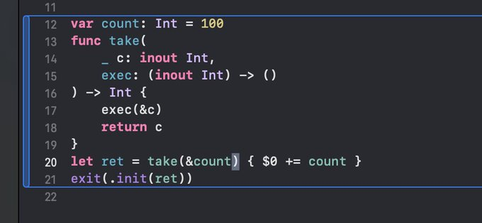
我开始尝试关闭编译器优化, 重新编译运行. 同样能正常运行, 没有报Simultaneous access的运行时错误.
为了对的起我的起床, 我决定深入研究一下. 我先简化代码, 然后阅读汇编代码.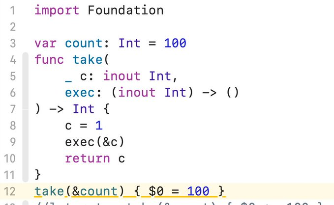
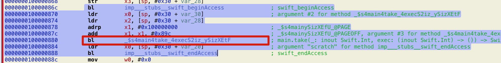
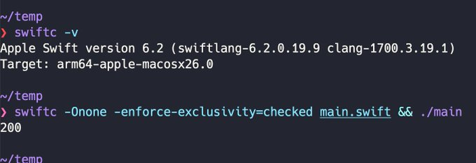
通过上图, 可以看到take方法的调用在swift_beginsAccess与 swift_endAccess之间, 说明swift确实检查了内存安全. 但是它只检查了一次, 并没有针对第8行的闭包和take方法分别检查, 所以我的程序能过正常运行.
对了, swift_beginsAccess 方法会对访问内容进行检查, 如果都是读取操作不会有问题, 如果针对某个地址还有其它操作就会报运行时错误.
confetti animation

This post is about creating a confetti animation in SwiftUI with a customizable duration. I learned the technique from this Patreon tutorial.
In the original animation, the confetti pieces would change color while falling, which I considered a bug. I’ve since fixed it. Another optimization I considered was adding a fade-out effect to make the disappearance of the confetti smoother, but the result wasn’t satisfactory, so I have not included that change.
Let’s break down how to build this.
Step 1: Animate a Single Piece of Confetti
First, we’ll create the animation for a single piece of confetti. The code and the result are below:

1
2
3
4
5
6
7
8
9
10
11
12
13
14
15
16
17
18
19
20
struct ConfettiView: View {
    @State private var animate = false
    @State private var xSpeed = Double.random(in: 0.7...2.0)
    @State private var zSpeed = Double.random(in: 1.0...2.0)
    @State private var anchor = CGFloat.random(in: 0...1).rounded()
    @State private var color: Color = [.orange, .green, .blue, .red, .yellow].randomElement() ?? .green

    var body: some View {
        Rectangle()
            .fill(color)
            .frame(width: 14, height: 14)
            .onAppear { animate = true }
            .rotation3DEffect(.degrees(animate ? 360 : 0), axis: (x: 1, y: 0, z: 0))
            .animation(.linear(duration: xSpeed).repeatForever(autoreverses: false), value: animate)
            .rotation3DEffect(.degrees(animate ? 360 : 0),
                              axis: (x: 0, y: 0, z: 1),
                              anchor: UnitPoint(x: anchor, y: anchor))
            .animation(.linear(duration: zSpeed).repeatForever(autoreverses: false), value: animate)
    }
}
This line of code is the key to fixing the color-changing issue:
@State private var color: Color = [.orange, .green, .blue, .red, .yellow].randomElement() ?? .green
The color used to change because the original code would assign a new random color during the animation process. By using @State to store the color, we ensure its value is preserved for the view’s lifetime, preventing the color from changing unexpectedly.
Step 2: Create the Confetti Container
Next, we’ll create a container to hold 50 confetti pieces and manage their positioning.
1
2
3
4
5
6
7
8
9
10
11
12
13
14
15
16
17
18
19
20
21
22
struct ConfettiContainerView: View {
    var count: Int = 50
    @State private var ySeed: CGFloat = 0

    var body: some View {
        GeometryReader { geo in
            ZStack {
                ForEach(0..<count, id: \.self) { _ in
                    ConfettiView()
                        .position(
                            x: CGFloat.random(in: 0...geo.size.width),
                            y: ySeed == 0 ? 0 : CGFloat.random(in: 0...geo.size.height)
                        )
                }
            }
            .ignoresSafeArea()
            .onAppear {
                ySeed = geo.size.height
            }
        }
    }
}
Step 3: Encapsulate as a View Modifier
Finally, to make the animation reusable and easy to apply, we’ll wrap it in a ViewModifier.
1
2
3
4
5
6
7
8
9
10
11
12
13
14
15
16
17
18
19
20
21
22
23
24
25
26
27
28
29
30
31
32
33
34
35
36
37
38
39
40
41
42
43
44
45
46
47
48
49
50
51
52
53
54
55
56
57
58
59
60
61
62
struct ConfettiModifier: ViewModifier {
    @Binding var isActive: Bool
    @State private var opacity = 1.0

    private let animationTime = 3.0
    private let fadeTime = 1.6

    func body(content: Content) -> some View {
        content
            .overlay(
                ZStack {
                    if isActive {
                        ConfettiContainerView()
                            .opacity(opacity)
                            .allowsHitTesting(false)
                    }
                }
            )
            .onChange(of: isActive) { _, newValue in
                guard newValue else { return }
                Task {
                    await sequence()
                }
            }
    }

    private func sequence() async {
        do {
            try await Task.sleep(nanoseconds: UInt64(animationTime * 1_000_000_000))

            withAnimation(.easeOut(duration: fadeTime)) {
                opacity = 0
            }

            try await Task.sleep(nanoseconds: UInt64(fadeTime * 1_000_000_000))
            isActive = false
            opacity = 1.0
        } catch {}
    }
}

extension View {
    func displayConfetti(isActive: Binding<Bool>) -> some View {
        modifier(ConfettiModifier(isActive: isActive))
    }
}

// Usage Example
struct ContentView: View {
    @State private var showConfetti = false

    var body: some View {
        VStack {
            Text("You did it!").font(.title.bold())
            Button("Celebrate") {
                showConfetti = true
            }
        }
        .frame(maxWidth: .infinity, maxHeight: .infinity)
        .displayConfetti(isActive: $showConfetti)
    }
}